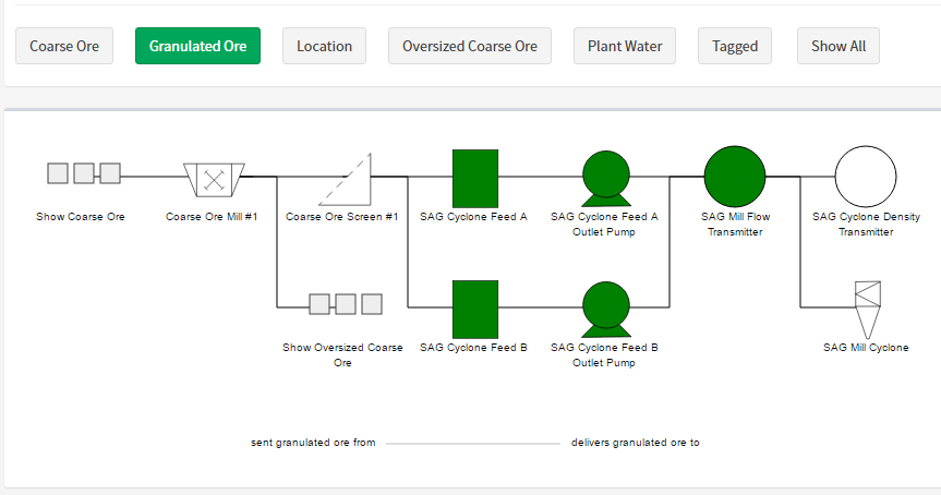
Diagrams
ARDI uses diagrams to show you how your asset is connected to others.
It creates a unique diagram for every relationship your asset has. If it is part of the gas system, there's a diagram for that. If it's connected to water piping, there's a diagram for that too.
There are also diagrams for your hierarchies, allowing you to browse your system from the top down.
Getting There
You can get to the diagram page from the 'Hierarchies' and 'Connections' menus in the sidebar.
Changing Your Perspective
At the top of the diagram is a list of relationships that are associated with your selected asset. For example, if your asset is part of the 'Hydraulic Supply' relationship, then there will be a button marked 'Hydraulic Supply' above the diagram.
By pressing these buttons, you completely change the diagram below to reflect your properties from a different perspective.
If your asset doesn't already have a relationship of the type you'd like to see, you can use the 'Show All' button and choose the relationship name from a list. This is particularly useful when adding new relationships to an existing asset.
Direct Parents
This diagram is built specifically for each asset, so the assets to the left of the selected asset only show direct parents.
For an example of this, let’s look at the location hierarchy for our sample data.
In the image below, we are looking at the Location hierarchy with the office selected. It shows details of every part of the office.
However, when we look at one of the assets inside the office - let's say the temperature transmitter under the air-conditioning system - we only see those items that are directly related to the temperature transmitter – not the less relevant assets.
Interacting
You can interact with your diagram in a number of ways…
Moving Around
If your diagram is large, white arrows will appear to the left and right of the image, allowing you to scroll left or right in order to be able to see the entire drawing.
You can also use your scroll-wheel (or drag) to scroll up and down when there are large numbers of child assets.
By clicking on any of the other assets in your scene, you re-draw the diagram based on their perspective. Note that this will also change the list of relationships available, as not all items are connected the same way.
Finding Out More
The selected asset has buttons to allow you to access the dashboard, details page and optionally charts related to your asset.
Symbols
ARDI maintains a symbol library - any asset can be given a symbol that is drawn in the digram instead of the standard circle. This makes your diagram easier to understand without having to read the names of each individual asset.
This way, tanks, pumps and valves are all instantly recognisable.
Large Numbers of Children
If your asset has a large number of downstream assets, this diagram will simply show the next level down (ie. all of the assets direct children), with a ‘More’ button indicating that there is extra content available.
Colours and Symbols
Some assets in your diagram have additional colours and symbols added to describe other relationships they have.
| Symbol | Meaning |
|---|---|
| Left-Pointing Arrow | This asset has one or more parents on a relationship |
| Right-Pointing Arrow | This asset has one or more children on a relationship |
| Circle | This asset has both parents and children on a relationship |
The Legend button (described under options below) pops up a guide to the meaning of the various colours.
In the image above, we can see that Stove #1 Thermal Pile receives Natural Gas and Cold Blast and outputs Hot Blast. It is also Integrated with another asset.
Options
On the top-right of your diagram, you'll see a few buttons that change the behaviour of your diagram.
| Option | Meaning |
|---|---|
| Name / Ref. No | Switches between looking at the name of the asset and the ERN of the asset |
| Legend | Displays a small legend to explain the colours available on assets |
| Tree View | Changes the display to a list rather than a diagram. This display is more compact and concise - useful when dealing with complex objects or large hierarchies |
| Eye | The blue eye button opens the diagram as an image in your browser |
| Disk | Save the diagram as an SVG file for later use |


