Advanced Charts
As well as a single trendline, there are many other charts available.
These are accessed by clicking on the Charts button either in the dashboard or the diagram for your asset.
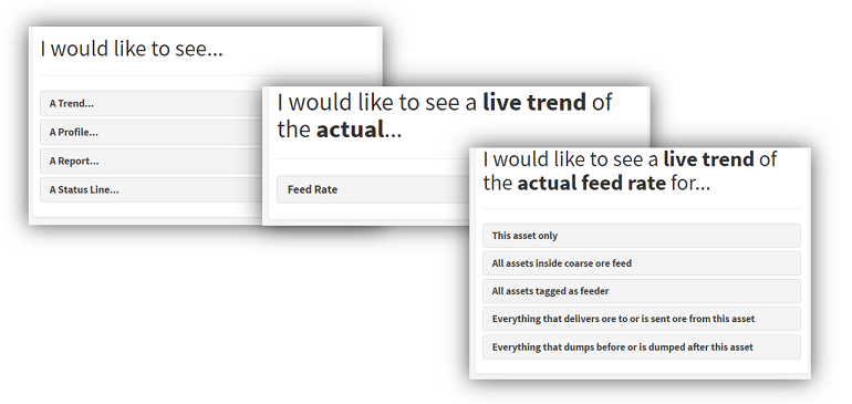
ARDI uses your relationships to help create charts that might be meaningful for you. It guides you through the process by asking three questions…
- The type of chart you’d like to make
- The property you want to report on
- The assets you’d like to show.
Single-Line Charts
For example, the standard single trendline chart can be made by choosing that you would like to see a trend of the property for this asset only.
This is identical to the chart you get by clicking on a property in the dashboard.
Multi-Line Charts
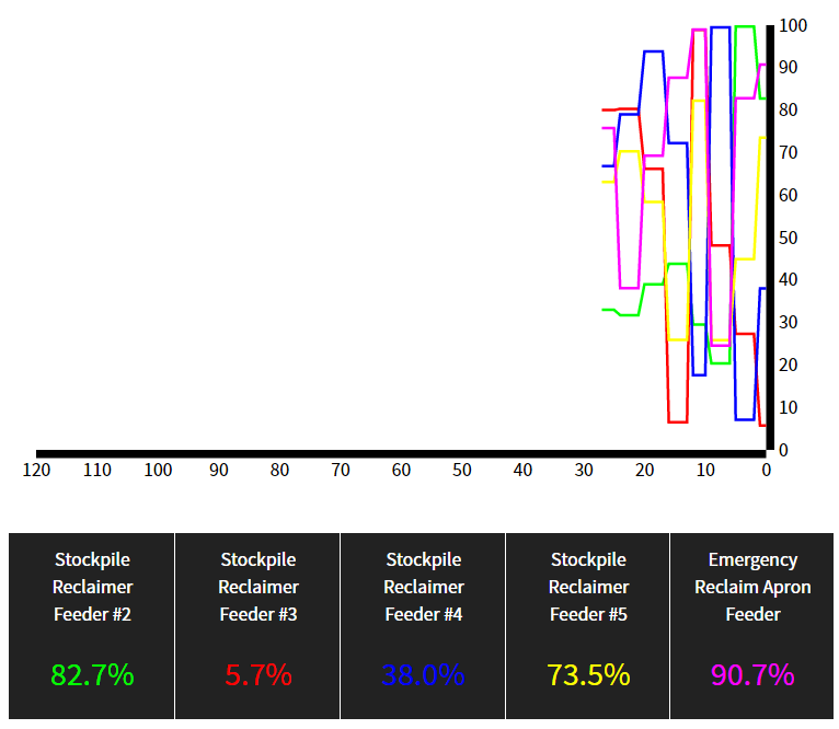
You can make a multi-line trend chart by using the relationships to select which assets you’d like to include.
For example, let's look at an ore feeder. They pour rock onto a conveyor belt and there are usually several of them running at once, taking rock from different parts of the stockpile.
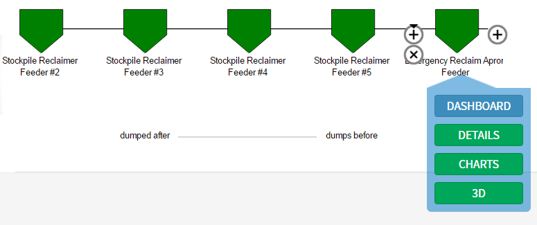
Our feeder asset has three relationships (Location, Granulated Ore and Conveyor Sequence) and is tagged as a ‘Feeder’.
Using these relationships, ARDI will allow you to quickly produce a chart that compares your asset to…
- All of the feeders on the plant.
- All of the assets in the same section/machine
- All of the assets that are part of the granulated ore transfer line
- All of the feeders in the conveyor belt dumping sequence.
Profiles
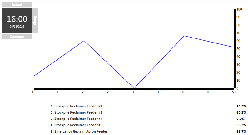
A profile is a chart which uses your relationship as an axis.
In the above example, there’s a chart that shows five feeders. In this case, they all dump their contents onto the same conveyor belt.
They drop their contents in a specific order – feeder #2, #3, #4, #5 and the Emergency Reclaimer Apron Feeder.
It just so happens that we have a relationship named sequence which follows this pattern, starting at Feeder #2 and working its way through to the reclaimer feeder. The ARDI diagram is shown below…
If we were to make a profile chart of this, we will end up with a chart where the Y-axis is the property we are interested in, while the X-axis is the order of the asset in the relationship.
On the chart page, we choose to show a profile of the property for Everything that dumps before or after this asset.
This style of chart is great for discovering problems with load balancing and locating potential leaks or blockages in process lines. Watching it update for live values is also a simple way of keeping an eye on the state of your important measurements.
Status Lines
Trends and profiles work for analogue measurements – meaning that they won’t allow you to choose properties that are digitals or enumerations.
If you’d like a chart to show how these discrete properties have changed, the Status Line chart will allow you to choose between your non-analogue properties to build a chart around them.


