Scatter Plot Pages
Once you've chosen what you want on your x and y axis, you'll be taken to the scatter plot page.
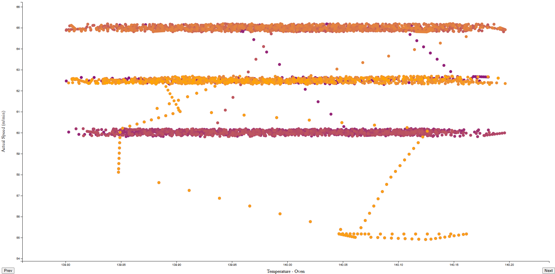
When the data is loaded, your points will appear. These will be coloured and animated in time order, so you'll get an indication of how the relationship changed over time.
In the example below, the Actual Speed clusters around 60, 63 and 65 m/min. Thanks to the colouring, you can also see it's not randomly scattered - it spends lengths of time at each value before transitioning to the next.
This is even more obvious when animated - see the example here.
Moving Between Measurements
You can use the Previous and Next buttons at the bottom of the screen to move between different properties along the X axis.
Once the data is loaded, your scatter points will animate to new positions.
