Data Quality UI
When you click on an Data Quality test in FirstSite, you'll be taken to a web page that looks like the one below…
Test Results
At the top of the page are your test results, showing you if the asset is running in an unusual way.
In most cases, you want this to be green (OK).
Observations
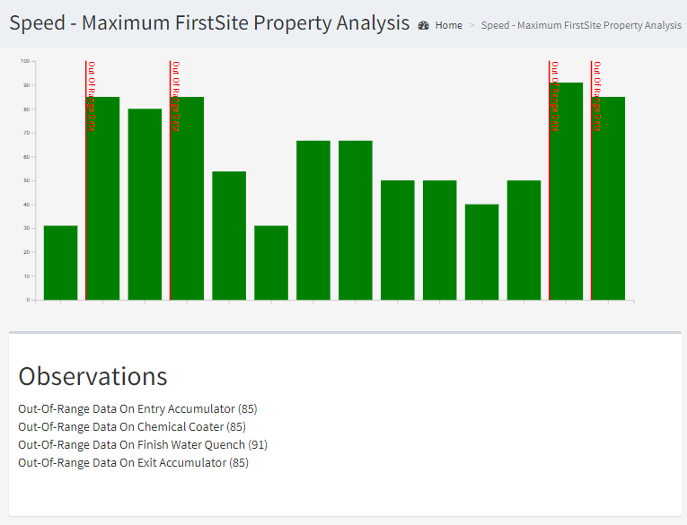
The Observations list includes all of the reasons why your test has returned a result other than OK.
Chart
The chart is a simple bar-chart showing the value of every measurement taken of the chosen property.
Data that is bad or out-of-range will be highlighted so that it's clear where issues have been found.
